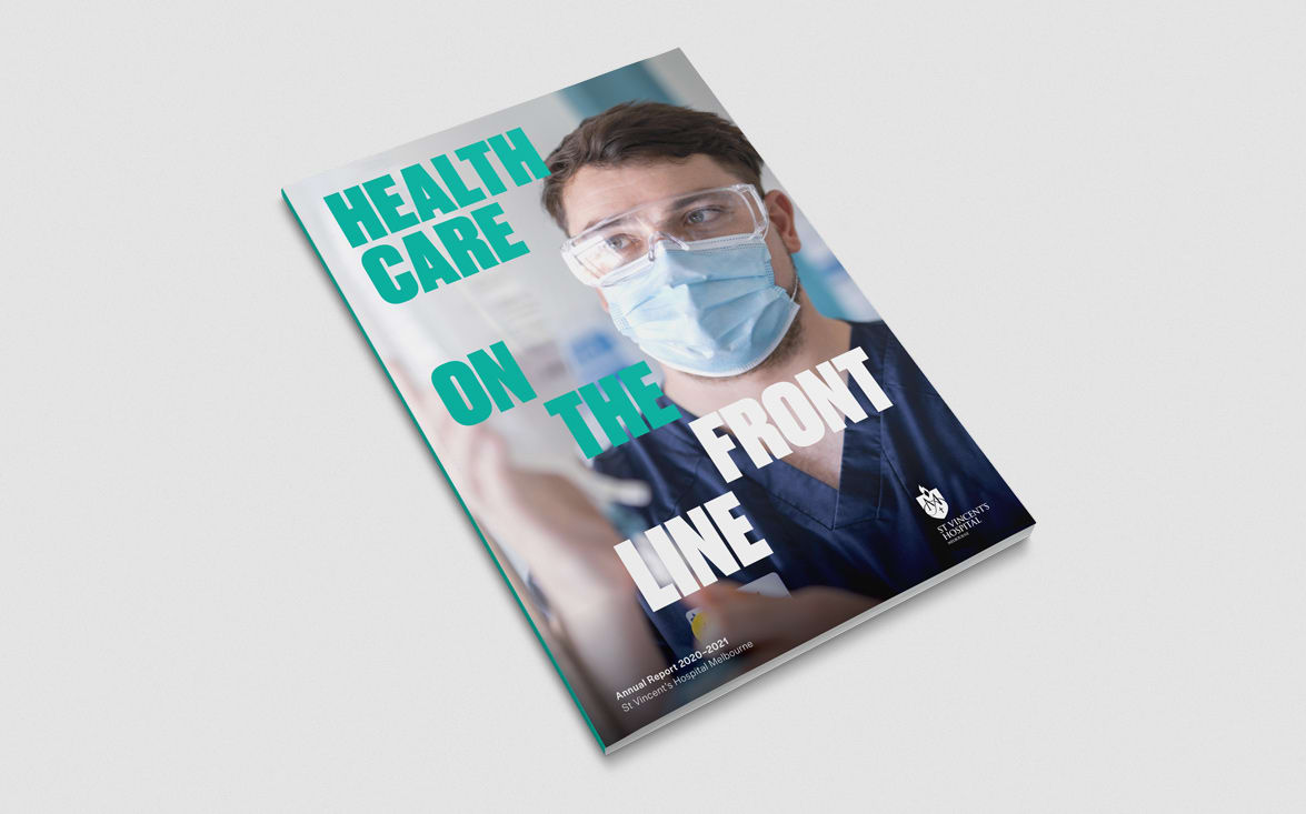
As 2020–21 has been vastly different to every other year, we took this report concept in a new direction – one which highlights the importance of St Vincent’s front line workers.
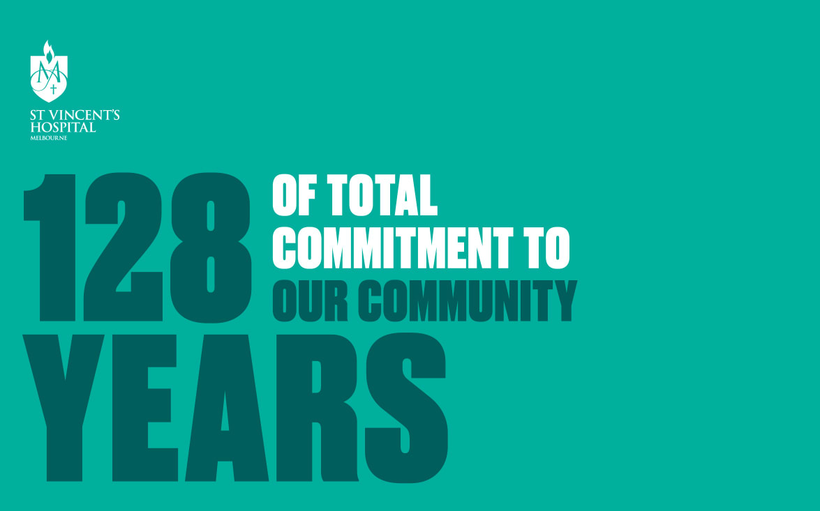
We’ve used bold, condensed type combined with block colour to give the Reports a striking visual aesthetic – one that is often used for social movements/campaigns. Here we’ve paired it with imagery that heroes STV staff to celebrate frontline workers.
The typography is dynamic and we’ve used colour and scale to create emphasis on certain words and tell a story with the messaging.


